Use this space to roast the new Instagram logo
Meta has unveiled a new Instagram logo, which some people are calling corporate ragebait. The logo features a unique blend of cursive and sans-serif letters, with some letters connecting and others not. Users are encouraged to share their thoughts on the new logo, with so…
Intelligence analysis by Llama
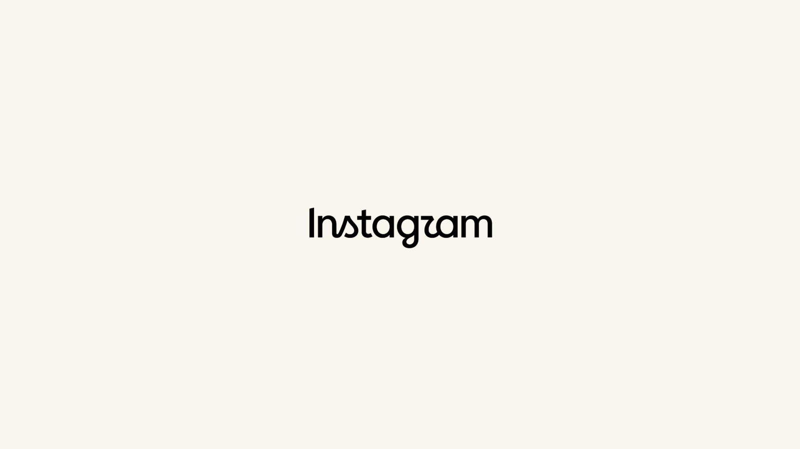
The new Instagram logo has been met with confusion and disgust, with some people calling it corporate ragebait. The logo features a unique blend of cursive and sans-serif letters, with some letters connecting and others not.
Imagine you're looking at a picture of a cat. Now, imagine that the cat's face is made up of different letters, like a puzzle. That's kind of what the new Instagram logo looks like. It's a mix of different lettering styles that can be confusing to look at. But, if you take a closer look, you can see that the designers have carefully crafted each letter to create a sense of flow and continuity. It's like a puzzle that you have to solve to understand the logo.
Analysis
Instagram's New Logo: A Corporate Ragebait or a Refreshed Brand Identity?
The recent unveiling of Instagram's new logo has sparked a heated debate among users, with some hailing it as a "cleaner and more modern" refresh of the brand, while others have dubbed it corporate ragebait. The new logo features a unique blend of cursive and sans-serif letters, with some letters connecting and others not. This design choice has been met with confusion and disgust, with some users calling it "Instagzam".
At first glance, the new logo appears to be a jarring mix of different lettering styles. The curves of the cursive letters seem to terminate abruptly, while the sans-serif letters appear to be disconnected from the rest of the logo. This blend of styles creates a sense of visual tension, making the logo difficult to look at for an extended period.
However, upon closer inspection, it becomes clear that the new logo is not just a random collection of letters. The designers have carefully crafted each letter to create a sense of flow and continuity. The "t" and "a" letters, for example, are connected in a way that creates a sense of movement and fluidity. This attention to detail is a testament to the designers' skill and creativity.
Despite its unique design, the new logo has been met with criticism from some users. They argue that the logo is too corporate and lacks the personality and charm of the old logo. However, others see the new logo as a refreshing change of pace, a bold move that sets Instagram apart from other social media platforms.
Ultimately, the new Instagram logo is a reflection of the brand's values and identity. Whether it is seen as corporate ragebait or a refreshed brand identity, it is clear that the designers have put a lot of thought and effort into creating a logo that is both visually striking and meaningful.
The Impact of the New Logo on Instagram's Brand Identity
The new logo is a significant change for Instagram, and it has the potential to impact the brand's identity in a number of ways. On the one hand, the logo's unique design may help to set Instagram apart from other social media platforms, making it more recognizable and memorable. On the other hand, the logo's corporate feel may alienate some users who prefer a more personal and charming brand identity.
The Future of Instagram's Brand Identity
As Instagram continues to evolve and grow, its brand identity will likely undergo significant changes. The new logo is just one part of this process, and it will be interesting to see how the brand develops in the coming months and years. Will the new logo be a success, or will it be met with criticism and disdain? Only time will tell.
Conclusion
In conclusion, the new Instagram logo is a complex and multifaceted design that has sparked a heated debate among users. While some see it as a "cleaner and more modern" refresh of the brand, others have dubbed it corporate ragebait. Regardless of one's opinion on the logo, it is clear that the designers have put a lot of thought and effort into creating a logo that is both visually striking and meaningful.
Key points
- Instagram has unveiled a new logo, which features a unique blend of cursive and sans-serif letters.
- The new logo has been met with both praise and criticism, with some users calling it corporate ragebait.
- The designers have carefully crafted each letter to create a sense of flow and continuity.
- The new logo has the potential to impact Instagram's brand identity and user engagement.
If the new Instagram logo is a success, it could help to set the brand apart from other social media platforms and make it more recognizable and memorable. This could lead to increased user engagement and a stronger brand identity.
If the new Instagram logo is met with criticism and disdain, it could alienate some users and make the brand appear less personal and charming. This could lead to decreased user engagement and a weaker brand identity.